Sunday 24 November 2013

JR - a person you admire

JR is a photographer and street artist who started his incredible career as an artist by illegally tagging the streets of Paris. He was 15 years old and would venture into the subway tunnels and up onto the rooftops with his friends and spray paint their names. He found a camera in the subway and started photographing these excursions with his friends. He then made photocopies of the images and began pasting them onto the walls of Paris. One of the reasons I admire him and his work is because he has stayed true to these roots. He still has the same intentions, he wants to make his mark on the world and allow people to experience art during their everyday lives by putting it on the streets.


The sense of humour that JR has, not only in his work but also his personality is another quality that I admire about JR. His work is often quite funny and the interviews that I have seen him in and talks that he has given he comes across as an easy going person with a good sense of humour despite the fame of his work.


JR uses his work to get across a message, he wants to use it to make a comment on society and try and get other people to think differently about issues. He has done it with many projects but shown above is some of his work in Palestine. He photographed Palestinians and Israelis who had the same profession and pasted these photographs up next to one another. The work caused controversy when he told the public that he was pasting photographs of Israelis in Palestine and vice versa as there is so much hatred between the two nations. JR said that the people often could not even tell which photograph showed the Israeli and which one showed the Palestinian. 


Often JR uses his work to help people practically and also just allow them to feel part of something. He tries to get people involved and do art themselves. I believe that this is a great thing to provide someone, especially people from less privileged backgrounds. One example of his work helping a community practically is the project he did in Kenya after the post election violence. He photographed local people and printed the images onto huge vinyl sheets. With help from locals and his team the sheets were used to cover peoples rooftops to stop them from getting wet. 


JR is not afraid to go big. He pushes the limits of what can be done. If he has a big idea he will follow through with it rather than be daunted by the size of the project. Shown here is a project he did in Rio de Janerio called 'Women are Heroes.' Pasted onto the side of multiple houses on this hill are photographs of women who live in that area. The project must have been huge and I admire the way that JR undertakes these projects despite the workload that is involved.

Wednesday 6 November 2013

Study Task 01

Identify and explain 5 reasons why you chose to study on this programme.
  • The variety of different styles of the 3rd year work, no house style
  • Good facilities
  • Fairly small number of students on the course so it will be more personal
  • Unpretentious (unlike Kingston)
  • Focus on preparing students for Industry

Identify and explain 5 things that you want to learn during your time on the programme.
  • Illustration
  • Design for Web
  • Effective use of type 
  • Screen Printing
  • I want to learn about colour and effective use of colour.

Identify and explain 5 skills that you think are your strengths.
  • Branding
  • Editorial Design
  • Conceptual thinking
  • Good Knowledge of Adobe software 
  • Working under pressure

Identify and explain 5 things that you want to improve.
  • Illustration skills
  • Knowledge of print processes
  • Studio Photography
  • Documenting my design process
  • Giving Presentations

Identify and explain 5 ways that you will evaluate your progress.
  • Peer Feedback
  • Tutor Feedback
  • Comparing work 
  • Evalutions
  • Looking on Blog

Thursday 24 October 2013

Gestalt Theory

In a Design Principles seminar we looked at briefly at visual syntax. I wanted to find out more about this subject as I felt that it was not only interesting but would be beneficial to my design work. I came across something called the Gestalt theory which is closely related to visual syntax and gives six principles that affect the way that we perceive things.
The Gestalt theory was put together by a group of German psychologists in the 1920's. The theory is explained by the six gestalt principles. 

Principle One - Proximity
This principle of proximity is a fairly simple one but often something we don not think about. It states that things that are closer together will be perceived as belonging together. 

Principle Two - Similarity
The Similarity principle states that when things have similar characteristics we will automatically put them into groups. If a number of objects share similar characteristics such as size, colour and texture they will be perceived as belonging together

Principle Three - Common Fate
The principle of Common Fate states that objects moving in the same direction are perceived to be related to one another. They are also seen to be more related than stationery objects. 

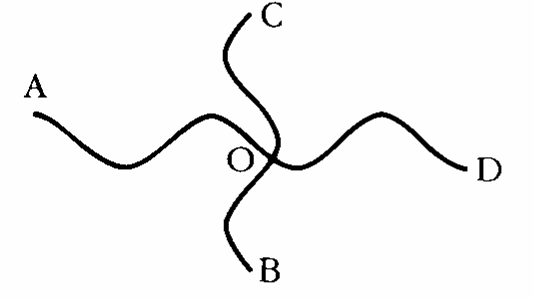
Principle Four - Good Continuation


I have displayed the diagram above to try and illustrate this principle as it is difficult to explain. The principle states that we prefer to perceive continuous figures. For example we perceive this as 2 overlapping lines rather than 4 lines that meet in the middle.

Principle Five - Closure
As humans, when presented with something less than the full picture we try to employ this principle and complete the image by filling in the missing information. This can be an effective tool o use within design but as designers we must make it easy for this to happen.


Principle 6 - Area and Symmetry
The principle of area and symmetry states that the smaller of two overlapping figures is perceived as the figure whilst the larger is the background. The principle of symmetry states that when something is not symmetrical the reader will waste time trying to figure out the problem rather than focusing on the image itself.

Fontsmith Type Samples


I emailed 'fontsmith' a typography design agency requesting some typography examples. I wanted to receive these to find out about typefaces that they have released but also to get some inspiration on designing with type and editorial design